Class Work Week 12: Elevator Pitch

What is an elevator pitch?

An elevator pitch is a short speech to spark interest into something from the audience, this can be anything from a project, idea, product or even myself. Elevator pitches should never be longer than 30 seconds, just like an elevator ride. Elevator pitches should always be memorable and interesting. My elevator pitch will be about my app.


  • Ever been stuck on what to do with your girlfriend or boyfriend?
  • Do you really want to impress your new date?
  • Do not fear, GoDate is here
  • Many couples day in and day out fight over the fact that their partner is so indecisive when making plans when going out.
  • GoDate is an app created to help with this issue.
  • Not only will GoDate help these indecisive couples choose an activity that they can do together but will also help with coming up with ideas in general.

Class Work Week 4: Personas & Scenarios

What is a User Persona?

A user persona can be a hypothetical representation of what the target audience either is or what you would like them to be. This can be represented through multiple attributes such as the goals and behaviors of these users. User personas are usually constructed through research on base and/or target audiences, however, sometimes they can be made from scratch.


The main users of my app are those who are primarily couples who are indecisive in making a decision on where and what they may be doing that night.
A realistic goal for someone using my app would be to find an activity that they could do with their partner for the evening, as they don’t know what to do with their afternoon together.


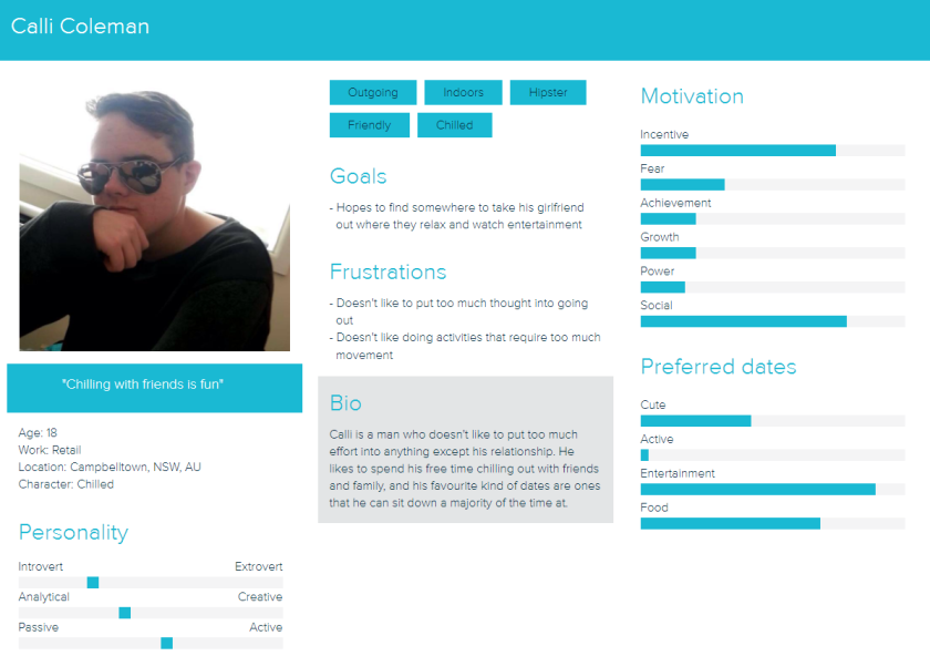
Below you can see the user personas that I have created and their respected user scenarios.

Aims

It is a Saturday afternoon and Amy is just about to leave home to go meet with her boyfriend at the train station. She has just realized they neither of them have made any proper plans for the night. Amy gets her phone out and pulls up the GoDate app. Amy then decides she is going look for something that isn’t too expensive, local and new to her. She then puts her preferred price range and the maximum travel distance to a minimum. She scrolls down the list that the app has given her and decides to try a local restaurant out that is not only cheap but also has live entertainment. Amy then saves the page into her favorites for later usage. She is done with the app for now and continues on her way.


calli boi

Calli is out with his girlfriend and have both just finished their breakfast. They are both interested in doing something together and are both a little indecisive. Calli pulls out his phone and goes onto the GoDate app. He then uses the filter in the app to show that he doesn’t have a preferred price range and decides he wants to do something entertaining so he clicks on the box next to entertainment. Calli scrolls down the list that the app has given him and decides with his partner that they will go to a cinema nearby to watch a movie. He doesn’t know the exact directions to the whereabouts of the cinema, so he clicks on the address that the app has given and it redirects him to Google maps with the address already entered.

Class Work Week 2: Unpacking An App Excercise 1: Western

Information Architecture:

What is included in the app? List the tools and modules in order:

  • maps, directory, events, emergency, vUWS, MyIT, students, central, library, shuttle, help, services, wellbeing, careers, grad life, videos, news, residence, books, food, social, summer, clubs, and sport.

Personally, I feel as if the tools and modules have been organized by most likely to be used to least likely to be used. However, I feel as if it would be more beneficial to categorize these modules into three simple categories; Social, Services, and Necessities. This ensures that the app doesn’t feel as claustrophobic as there is more room to breathe.

Site flow vs User flow

Site maps show everything and are used to help developers and designers make sure that they are on the same page.

User flow is the steps that a user would perform to complete a task on a website or during a UX process.

An example of site flow map on Western Sydney App:

Maps -> Parramatta train station -> Parramatta South Campus -> Class Room 6B

An example of user flow on Western Sydney App:

site flow

User Interface (UI):

Is the app easy to use? 

Apart from the app feels a little cluttering it wasn’t all too bad to navigate and was in fact, quite easy to follow along and find what I need.

Any suggestions?

The only suggestions I would have would be to categorize each tool and module.

Visual Design:

How do you describe the visual design?

I really like the icons that the app uses for each module. However, I believe the maroon is used too much on the main screen and could be toned down to match the rest of the app.

Does it match the university’s brand image?

Yes, the app does indeed match the university’s brand image and represents the university quite well.

What improvements could be made?

Rather than have the app have pages on the home screen, instead it could just have a scroll down option for easier navigation.